
About This Project
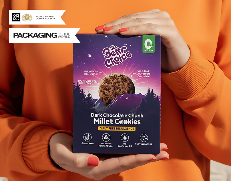
The Bettr Choice is a cookie brand that's trying to change how people think about healthy snacking. The brief was ambitious: create a brand that feels as exciting and desirable as a mainstream indulgent snack, while clearly communicating that these cookies are actually good for you and the planet.
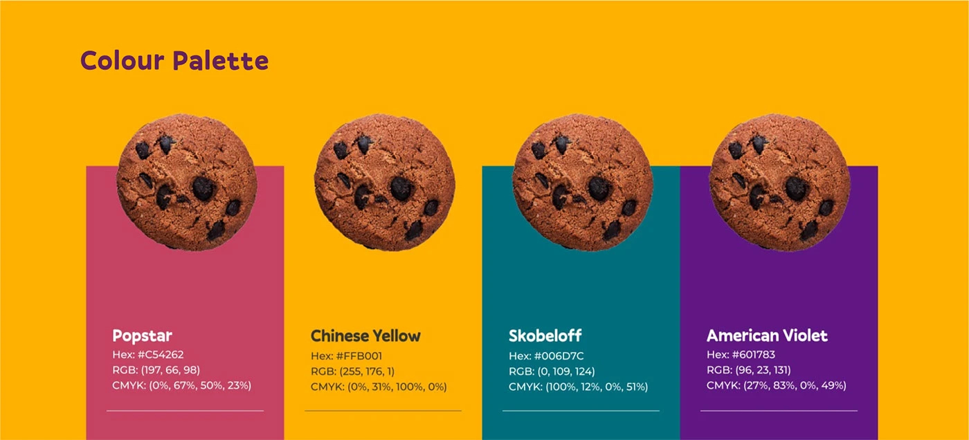
We shaped the visual identity around three pillars — health, taste, and sustainability — giving each equal weight in the design system. The result is playful packaging that pops on shelf and screen, clean enough to build trust with health-conscious parents, and bold enough to catch the eye of the mainstream snack buyer.
The work was recognized by both the World Brand Design Society and Packaging of the World — two of the most respected publications in brand and packaging design.
What We Delivered
- Complete brand identity
- Product packaging for multiple SKUs
- Brand guidelines
- Retail-ready packaging design
- E-commerce ready imagery
Tags
Services Used
Visual Showcase
Selected Work Excerpts
A closer look at the actual design presentation. The full public project deck is linked on Behance.
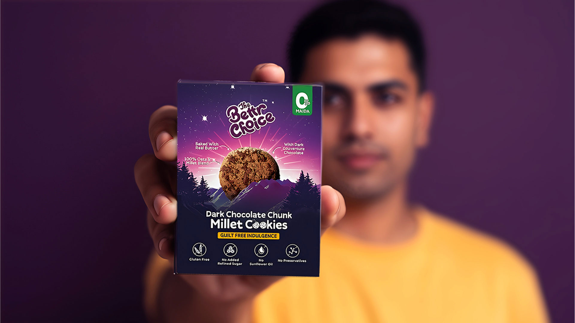
Healthy snack brand identity design
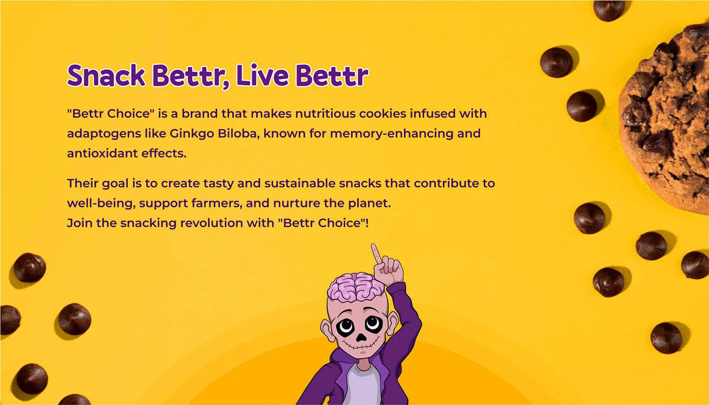
Cookie packaging design system
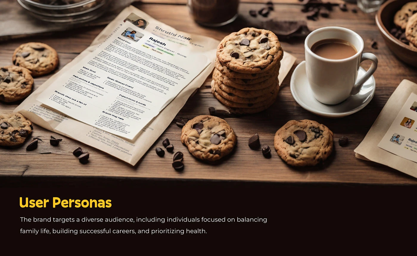
Sustainable food packaging for FMCG
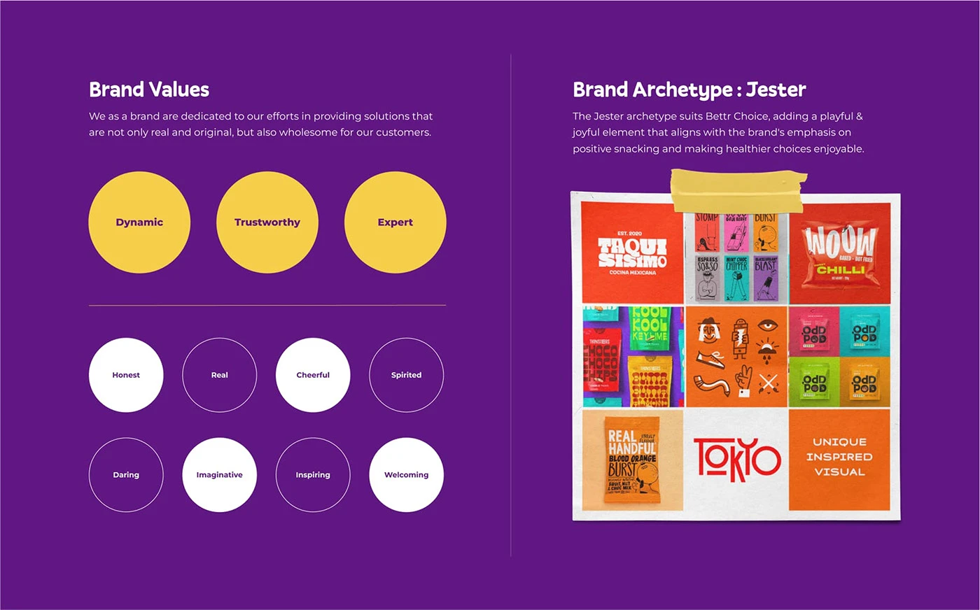
The Bettr Choice retail packaging
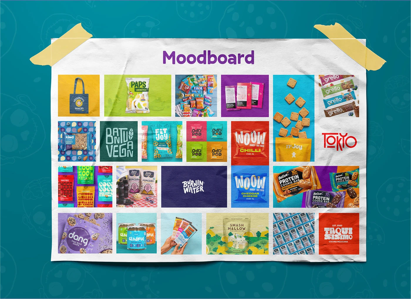
Better-for-you snack brand visuals
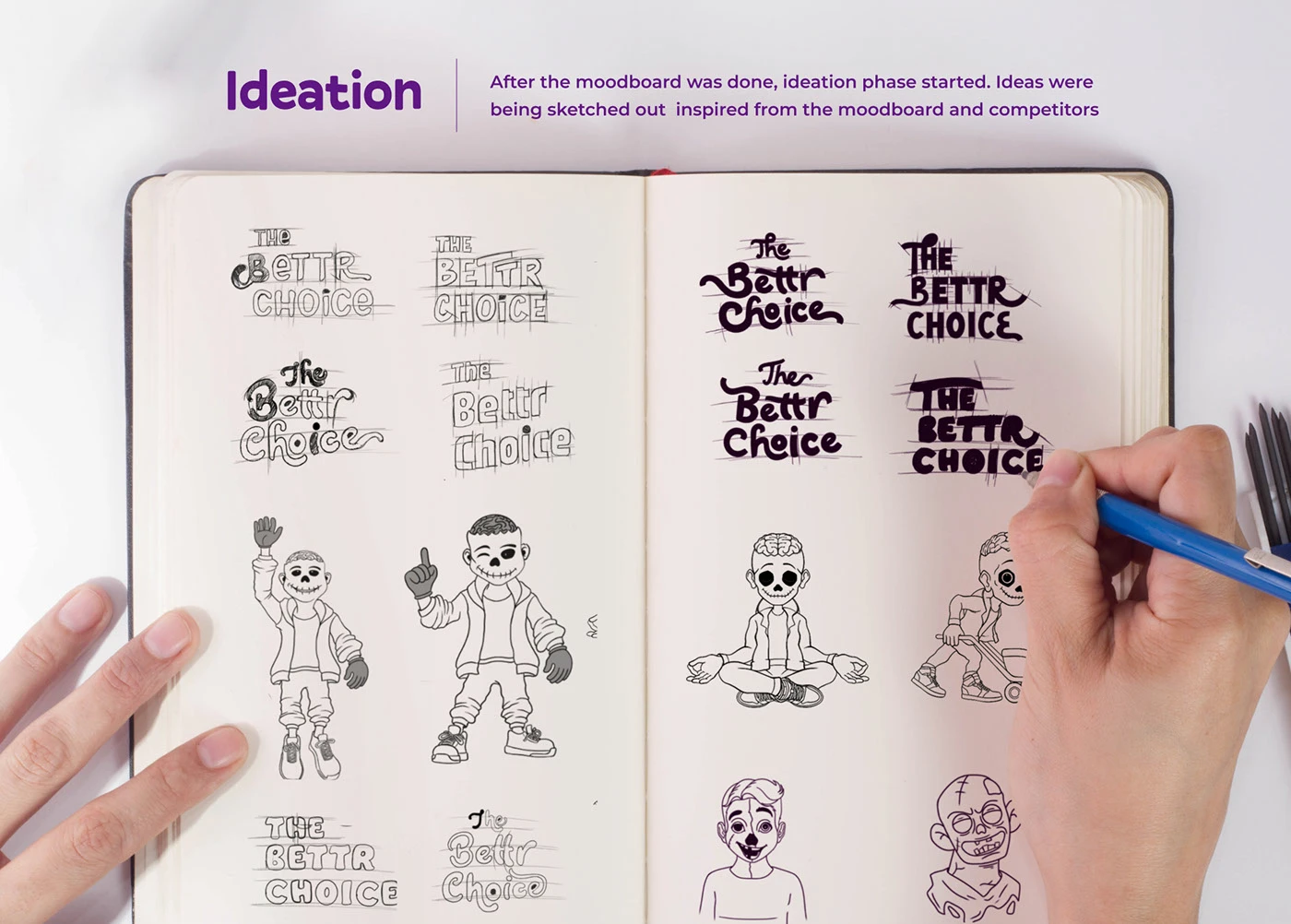
Food brand typography and illustration
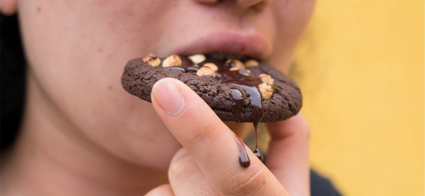
Cookie box packaging design
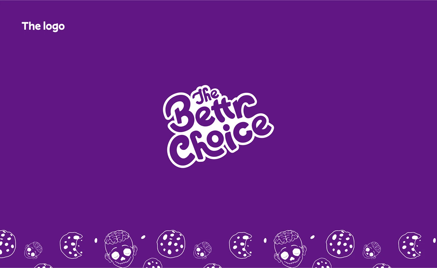
D2C snack brand visual identity
Premium healthy cookie packaging
The Challenge
Bettr needed to create a cookie brand that communicated health and sustainability without looking like boring 'health food.' The visual identity had to be playful enough to compete with mainstream snack brands while being trustworthy enough for health-conscious consumers.
Our Approach
We built the brand around three pillars — health, taste, and sustainability — and designed a visual system that gives equal weight to all three. Bright, energetic colours signal that these cookies are fun and delicious, while clean layouts and honest copy communicate the health credentials without preaching.
Results
Featured by World Brand Design Society
Featured by Packaging of the World
Brand successfully positioned in the premium healthy snack segment
View the full visual presentation on Behance
View on Behance
Want Something Like This?
Tell us about your project and we'll show you what's possible.
Start a Conversation