

Elix Premium Whiskey
Elix
About This Project
Elix is a premium Indian whiskey brand born from a single pursuit: excellence in every detail. In a market dominated by established international labels and legacy Indian brands, Elix needed to carve out a distinct identity that says 'premium' without saying it too loudly.
We crafted both the brand identity and the complete packaging system — from the bottle silhouette and label typography to the secondary packaging and brand guidelines. The design philosophy was restraint: letting the quality speak through material choices, precise typography, and a colour palette that feels expensive without being ostentatious.
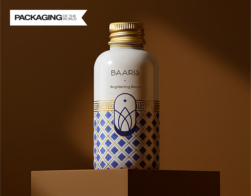
This project was recognized by three major design publications — the World Brand Design Society, Packaging of the World, and Young Designers India — a testament to the balance of commercial viability and design craft.
What We Delivered
- Complete brand identity
- Bottle and label design
- Packaging system
- Secondary packaging
- Brand guidelines
Tags
Services Used
Visual Showcase
Selected Work Excerpts
A closer look at the actual design presentation. The full public project deck is linked on Behance.

Premium whiskey packaging design

Luxury liquor bottle label design

Indian whiskey brand identity system

Elix bottle mockup and shelf presence

Spirits packaging typography and materials

Premium alcohol brand collateral

Whiskey box and secondary packaging

Luxury beverage visual identity details

Elix retail packaging presentation

Premium Indian whiskey brand guidelines
The Challenge
Elix needed to enter the premium Indian whiskey market with packaging that could compete with established international brands. The design had to communicate refined taste and quality craftsmanship while maintaining shelf presence in competitive retail environments.
Our Approach
We built the brand around the concept of relentless pursuit of excellence — reflected in every design detail from the bottle silhouette to the label typography. Premium materials, embossing, and a restrained color palette were chosen to signal quality to discerning consumers without the over-the-top ornamentation common in the category.
Results
Featured by World Brand Design Society
Featured by Packaging of the World
Recognized by Young Designers India
Strong shelf presence in competitive retail environments
View the full visual presentation on Behance
View on Behance
Want Something Like This?
Tell us about your project and we'll show you what's possible.
Start a Conversation